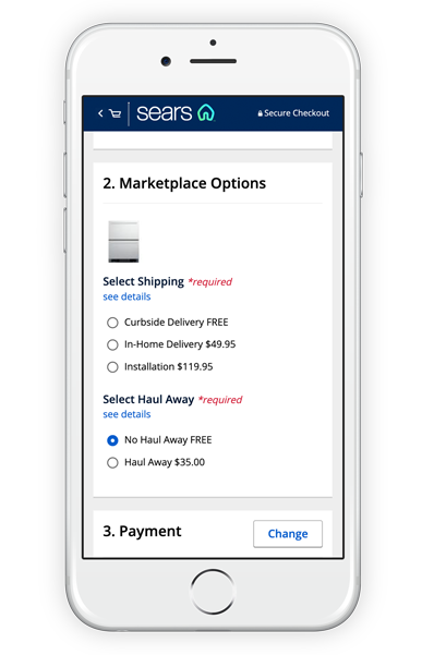
Marketplace Options
Role: UI/UX | Platform: Responsive Mobile / Web

Project Overview
Make it possible for users who purchase an appliance with a marketplace seller to select their desired delivery service. Currently the system relies on the user to respond to an email or phone call for setup.
Problem
There is a serious disconnect in the user experience for how delivery setup is done with third party sellers. In the current flow the customer purchases their product and then is sent an email to call the seller to set up the delivery time. This breaks the flow and puts an unneeded responsibility on both the user and the call center. By cutting the call center out of the flow the company can improve the flow and save on a large unneeded cost.
Outcome
Due to the large undertaking of the engineering and development work of this project it was broken down into phases. After multiple designs and iterations it was decided that the cart was the best place to house the new selection module. Initial testing proved to be successful and the project was added to the live site. In just a short amount of time, the data has shown that over 60% of users that purchase an appliance from the seller, utilize the new options feature.
Known Issues
Because of limitations the amount of appliances able to be purchased at one time had to be capped. When purchasing multiple products, especially on mobile, page length becomes an issue. Requiring the user to select up to three options per product becomes very repetitive quickly. Due to the urgency to get the concept to market quickly these issues were sacrificed and will be addressed in later phases.
Moving Forward
Taking the module from the bottom of the flow and moving it to product level helps elevate most of the known UX / UI issues. Adding a product option flyout that is triggered by the user selecting the add to cart CTA solves the long scrolling pages issue. The cart would then be the summary of the selected options and you would no longer need to cap the amount of products the user could purchase. You would also be removing a step in the checkout flow, making it a much smoother process.

Current

